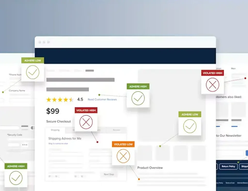
The homepage and checkout page are like two bookends.
One starts the story. The other closes the sale.
But most brands treat them like an afterthought — a place to put banners, buttons, and product grids.
Truth?
Your homepage and checkout pages are silent negotiators.
They persuade, reassure, guide, and convert.
Let me show you how one brand increased revenue simply by fixing these two pages.
The Campaign: When Traffic Was High but Sales Were Low
An online cosmetics brand — Velveta — couldn’t understand their problem.
- Tons of traffic
- Great advertising
- Strong social presence
- And a product customers loved
But conversions?
Flat.
Because their homepage was confusing, and their checkout had too much friction.
They didn’t need more traffic.
They needed a smoother path to purchase.
How We Did It
Homepage Optimization
1. Above-the-fold clarity
We replaced generic headlines with a strong value proposition.
People should understand your brand in 3 seconds or less.
2. Visual hierarchy redesign
We created clear sections for:
- Bestsellers
- Social proof
- Benefits
- Featured categories
- Offers
3. Story-driven product presentation
People buy stories, not features.
4. Micro-interactions
Hover effects, animations, and subtle motion made the experience feel alive.
5. Trust builders
We added badges, reviews, guarantees, and certifications.
Checkout Optimization
1. One-page checkout
Less clicking → more buying.
2. Auto-fill + address validation
Removing friction increases speed.
3. Guest checkout enabled
Never force account creation.
4. Clear shipping/return info
Honesty = confidence.
5. Optimized mobile checkout
Because 70% of Velveta’s orders came from mobile users.
The Winning Results
Within 45 days:
- Homepage conversions up 52%
- Checkout abandonment reduced by 29%
- Average order value increased by 18%
- Mobile conversions doubled
Velveta didn’t change their ads.
They changed their experience — and the sales followed.
Summary
Your homepage should make people feel something.
Your checkout should make purchasing effortless.
Together?
They form the backbone of revenue.
If your conversions aren’t where they should be, your homepage and checkout are the first places we optimize — because that’s usually where the magic happens.


Leave A Comment